
…and oh boy is it fun!
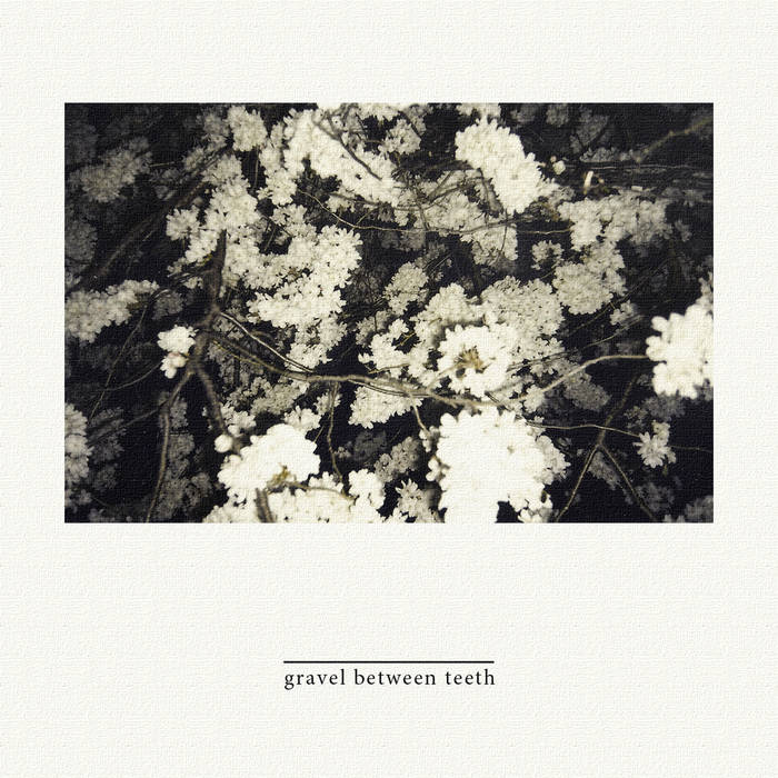
Slow Bloomer
New music is on the way. Heavy Indie Emo Punk Whatever.
Check it out below:
Roseweather – Album Design


Re/Lens Workshop – “It will be the past”
Experimental Short
Watch on vimeo for HD
Collaboration with Alejandro Jaramillo
Produced during one-day workshop by Union Docs / The New School
Poem by Patrick Phillips, recorded by Noah Smith for The Writer’s Almanac
Music by Dexter
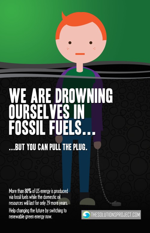
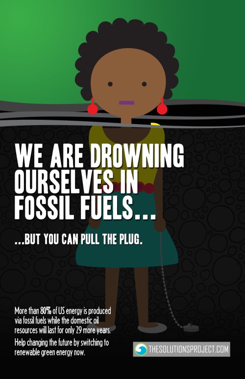
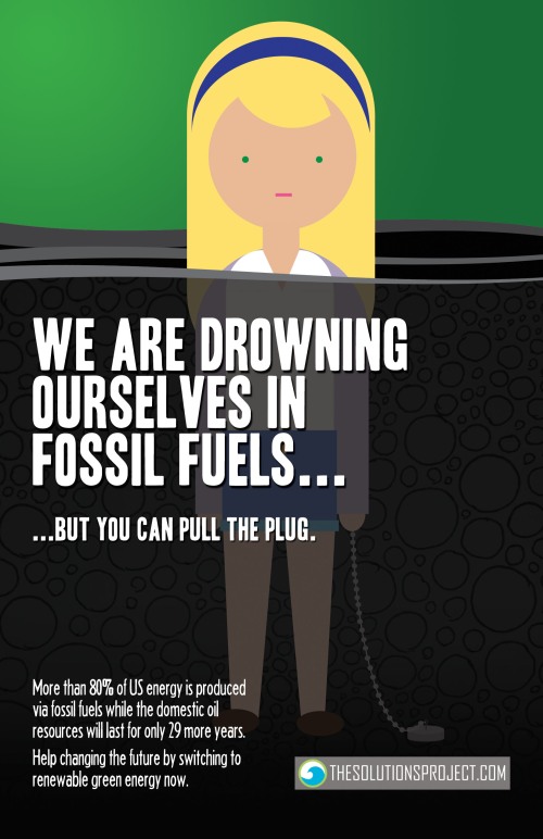
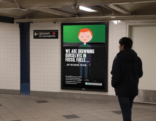
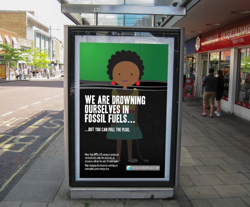
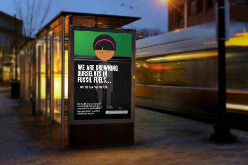
THESOLUTIONSPROJECT.ORG – Making the transition to renewable energy happen
The objective of this project was to promote public awareness of an idea, event, conference, NGO, organization or service through the design of a printed graphic (poster, flyer, billboard, carpet, truck, seat, display, …) to be displayed in public space. The design should incorporate image(s) and text. The given theme was Energy and the Future.
I decided to come up with a campaign that raises awareness for thesolutionsproject.org, a website dedicated to show easy, cheap and fast ways for people to transition into renewable energy supply. Illustrations done in Adobe Illustrator, posters put together in Adobe Photoshop. Here’s what the process of designing the campaign went:

These are the six images that made it into the final design:
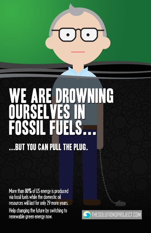
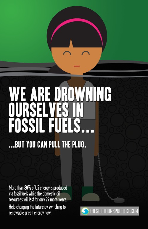
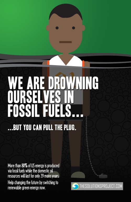
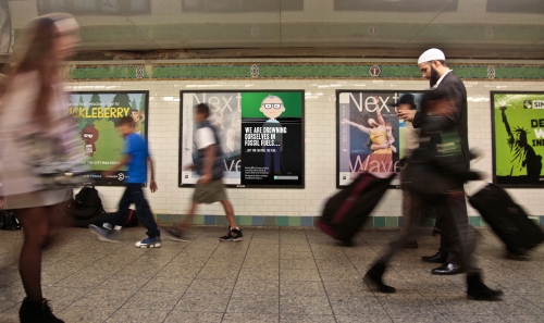
And mock-ups to show the campaign in its intended space:
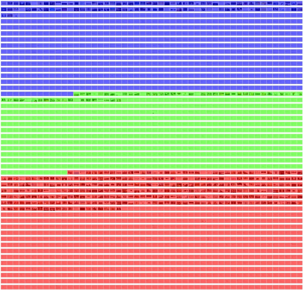
The virtual lives of young Western Muslimahs in support of ISIS
These are data visualizations I did for a journalistic project exploring the virtual lives of young women from the West who support ISIS. You can find the whole project including research questions, methodology and conclusions here. As it has not been published yet, use “womeninisis” as a password.
We did in-depth analysis for seven profiles and came up with three main themes – political, personal and religious. The following graphics are mosaic artworks consisting of the women’s own tweets and representing their profile pictures. They are personalized graphics that manage to show what their main interests are in an instant – red for political, green for personal and blue for religious. Use the full resolution versions to browse through their content in detail.
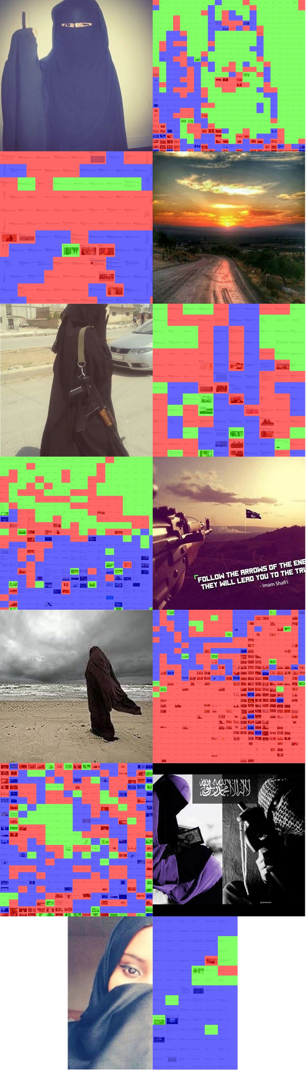
You can find full resolution versions for the profiles here:
Umm Salamah, Umm Yahya, Umm Ubaydah, Umm Haifa, Bint Stranger, Lioness of Tawheed, Najma
Another graphic adds up all tweets of all profiles and shows the slight domination of political content. You can also see where images have been used more often.
This graphic shows their change in themes over time and gives a direct comparison of the amount of output they had:

In this last graphic their activity is put into relation with real-life events. You can also see from when to when these girls have been active on twitter.

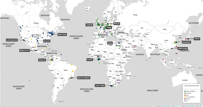
Through the lenses of flickr.
This is the final project of my Transforming Data class. For this class I learned how to code in Python. I wanted to make visible what the most frequently photographed places in certain cities are and also if there are notable differences between the origins of the photographers. What does the European flickr user find interesting in contrast to the Asian or American? Which cities are more international?
In order to find out, I first wrote a piece to scrape image data for the following cities:
Berlin, Paris & London
New York, Los Angeles & Dallas
Bogota, Mexico City & Rio de Janeiro
Shanghai, Tokyo & Hong Kong
Accra, Cape Town & Cairo
This is the piece of code I used to iterate through the first 5000 geotagged images that come up when doing a tag search consisting of the city name for each city:

After I gathered that information I could use the user’s IDs to construct their individual profile URL and parse it for their country of origin (if they had put that information online). Here’s the code I used for that:

After some manual data cleaning I was able to combine it all in this responsive map.
It is best viewed in full screen – have fun exploring!
 Note: The map is best viewed using Google Chrome as a browser
Here’s some trivia:
The map consists of 66,305 individual images. 3,871 photographers from 85 different countries have taken them.

Assignment 12: Bridge to next semester
What is it that I am trying to investigate in my practice, i.e. what I am most passionate about?
I really would like to go deeper into the design of information graphics, a topic I was always interested in. The path of transformation from data to information to knowledge to understanding is spiked with obstacles and many mistakes can be made. This is a challenge I feel ready to take on.
What are my strengths and weaknesses?
I think my strengths are an ability to combine analytical thinking with creativity. What I am still lacking is deeper knowledge of the tools to create what I have in mind. That’s why I want to expand my work in programming, Photoshop and Illustrator next year.
What are the core elements missing from my practice? How will I obtain them?
As I said, I need more working experience with some of the programs from Adobe’s creative suite as well as get deeper into programming. I decided to take the “Design Principles” and “Interactive Design” class next semester for that reason.
What was my preferred media before the course? After the course?
I was always interested in all the forms of media we went through this semester, be it film, photography or web. Right now, I think I feel most comfortable with going more into interactive online media. However, it was really cool to gain hands-on experience in all of those fields.
What is the next topic, theme, or question I would like to investigate in my next project?
In my other class this semester I dealt with mapping out pictures from Flickr. Doing interactive maps was a lot of fun and I think my next project is going to deal with location-based data as well, although I don’t have anything specific in mind yet.
What is something I learned in this class that I could teach to someone else?
How to use Photoshop, Premier and Lightroom.
What is something I will try to do next semester that I have never done before?
I thought about learning how to code JavaScript for a longer time. I should really get started with that.
What is something I will try to do every day or every week that I did not do before this course?
Work more with the mentioned programs to get a fluent work flow going.
What is a creative project that I would do with a budget of $150 million?
Buy all of New York’s public ad spaces for a day and have them only show my picture without any lead to anything. No website, nothing. Watch media and the internet go crazy.
How could I do the same project with a budget of $150?
Team up with Dale, my Transforming Data teacher to hack into all of the digital billboards and have the image displayed anyway 🙂
Assignment 11: Fine-tuning our app design
As Professor Kain suggested, I made the logo consistent at all places within the app. The megaphones are now inside the laurel wreath. Furthermore I decided to use a sans serif font that is also thinner for all continuous text. This way, readability can be enhanced. Serif fonts are usually used for print, not web. Only the Voice Over logo keeps the bolder serif font to stick out and show presence.
 Before on the left / After on the right
Assignment 10: Designing the Interactive Space, Part 2
What is Wabi-Sabi and why is it difficult to define?
Wabi-Sabi is a specific understanding of beauty appearing in traditional Japanese culture. It is difficult to define, because it doesn’t have concrete rules and is more of a subjective approach. One way would be to describe it as unsophisticated, natural or raw.
How is Wabi-Sabi different from modernism? How is it the same?
Modernism and Wabi-Sabi share some similarities. First, they can both be potentially found in any man-made object. They were also both abstract radical answers to existing definitions of beauty. What sets them apart are the overall feel – Wabi-Sabi tends to be warm, natural, crude, unfinished and raw, while modernism tends to be cool, slick and functional.
What is the metaphysical basis of Wabi-Sabi? What are its spiritual values?
According to Wabi-Sabi, all things are in constant change, the beginning and end being nothingness. So every object is always either evolving from nothingness or already devolving towards it again. All things are imperfect, all things are incomplete, all things are impermanent. These imperfections make their beauty possible.
What is the Wabi-Sabi state of mind? What are its moral precepts?
The Wabi-Sabi state of mind is coined by a certain loneliness and sadness coming from the acceptance of the inevitable ceasing of everything. Therefore, everything unnecessary should be left out to create beauty.
What are the material qualities of Wabi-Sabi?
The material quality should be, as stated before, a very simplistic one. An earthy, natural feel, unpretentious and intimate settings, and irregular patterns providing texture are characteristics of Wabi-Sabi art.
Here are some pictures a friend of mine took – I immediately had to think of them when I read about the concept of Wabi-Sabi. You can check out more of his work here.

 “a plain morning”, 2010

 Untitled, 2011
All of the pictures depict unaltered situations. They all deal with nature in some way and look for beauty in detail, I think. The third picture plays with the cycle of decay that is crucial to Wabi-Sabi philosophy. All of them emphasize the texture of the photographed objects. And although they are beautiful, there’s this certain feel of loneliness in them.
Another idea that came up for me immediately is that the concept of Wabi-Sabi can be found in underground music culture such as punk rock. Oftentimes the sound quality is not what matters, it’s the idea. Rough recordings done with one mic can be sufficient to bring across the energy of the song with an unfinished feel.
